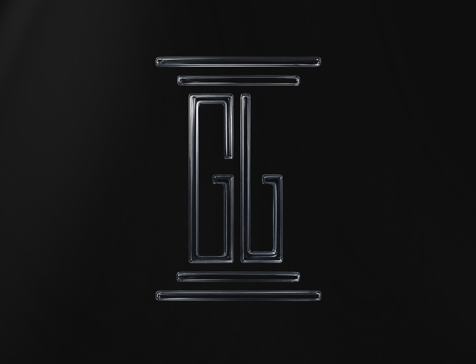
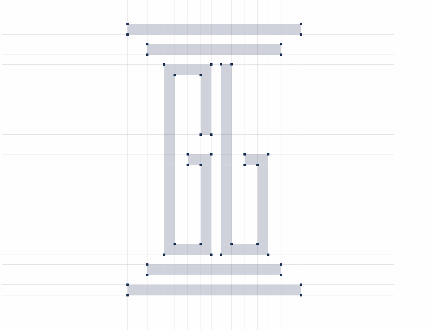
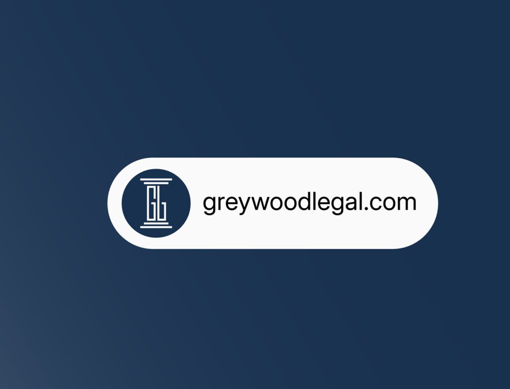
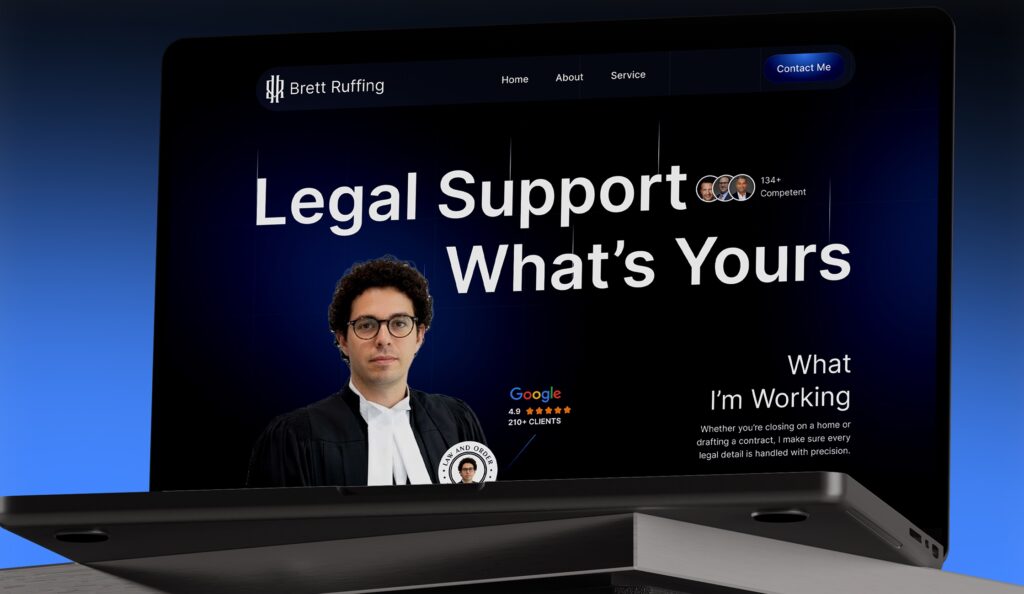
This stage was where Greywood Legal’s identity was fully translated into a cohesive brand system.
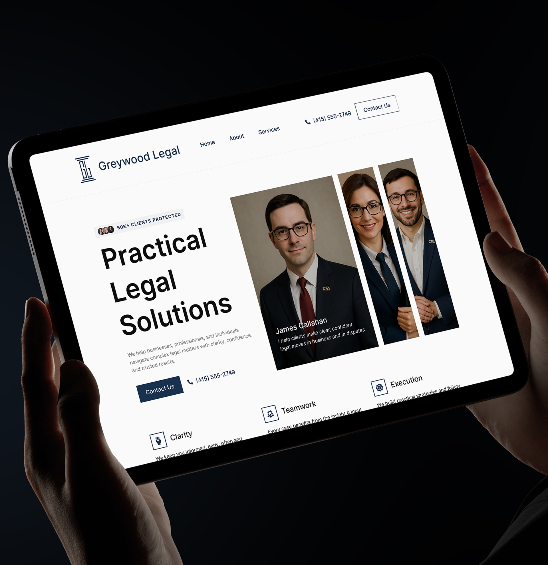
The firm is built on the idea of working as one unified legal team. Not a collection of individual practices, but a collaborative group of attorneys aligned around clarity, responsiveness, and results. The strategy needed to reflect that philosophy clearly and consistently across the entire website.
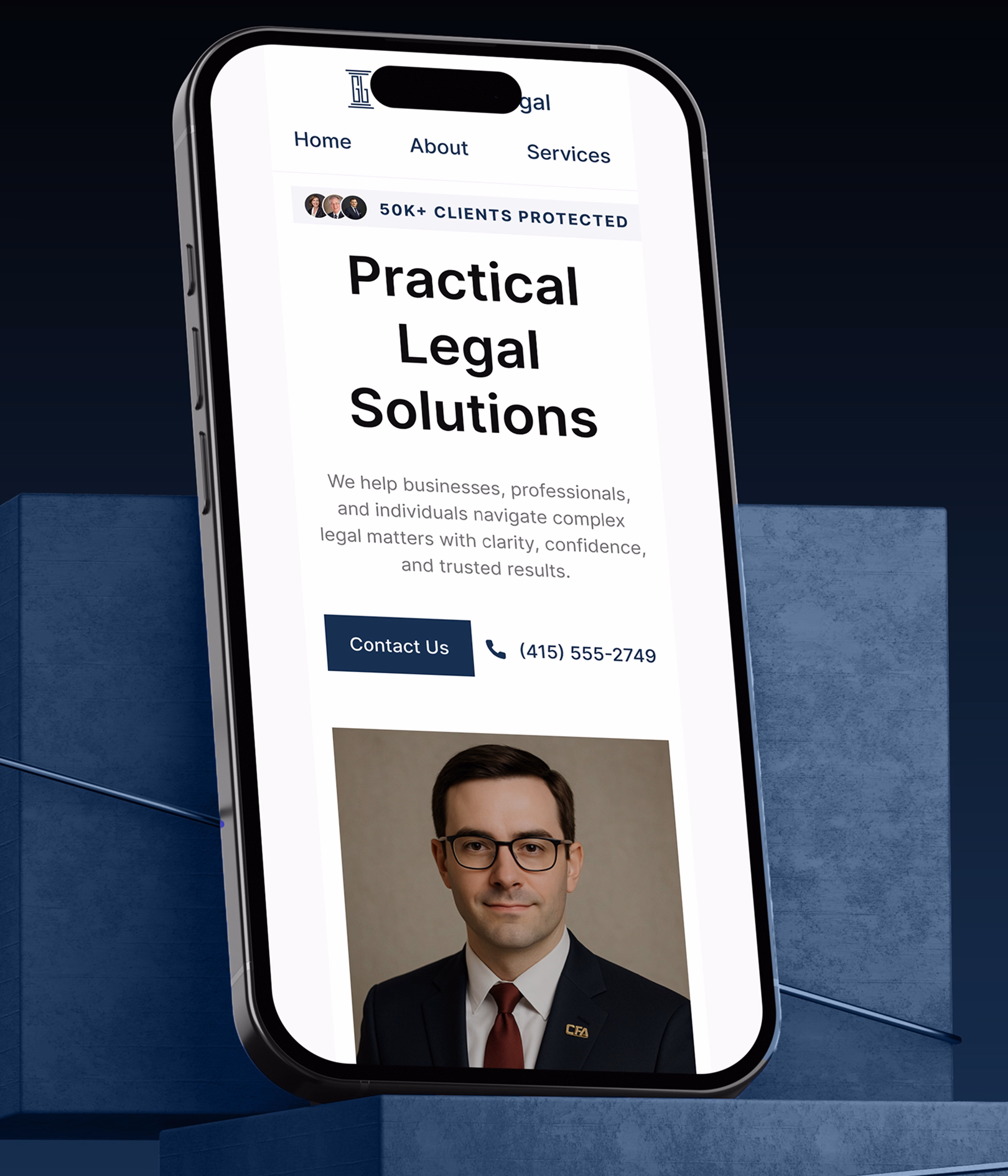
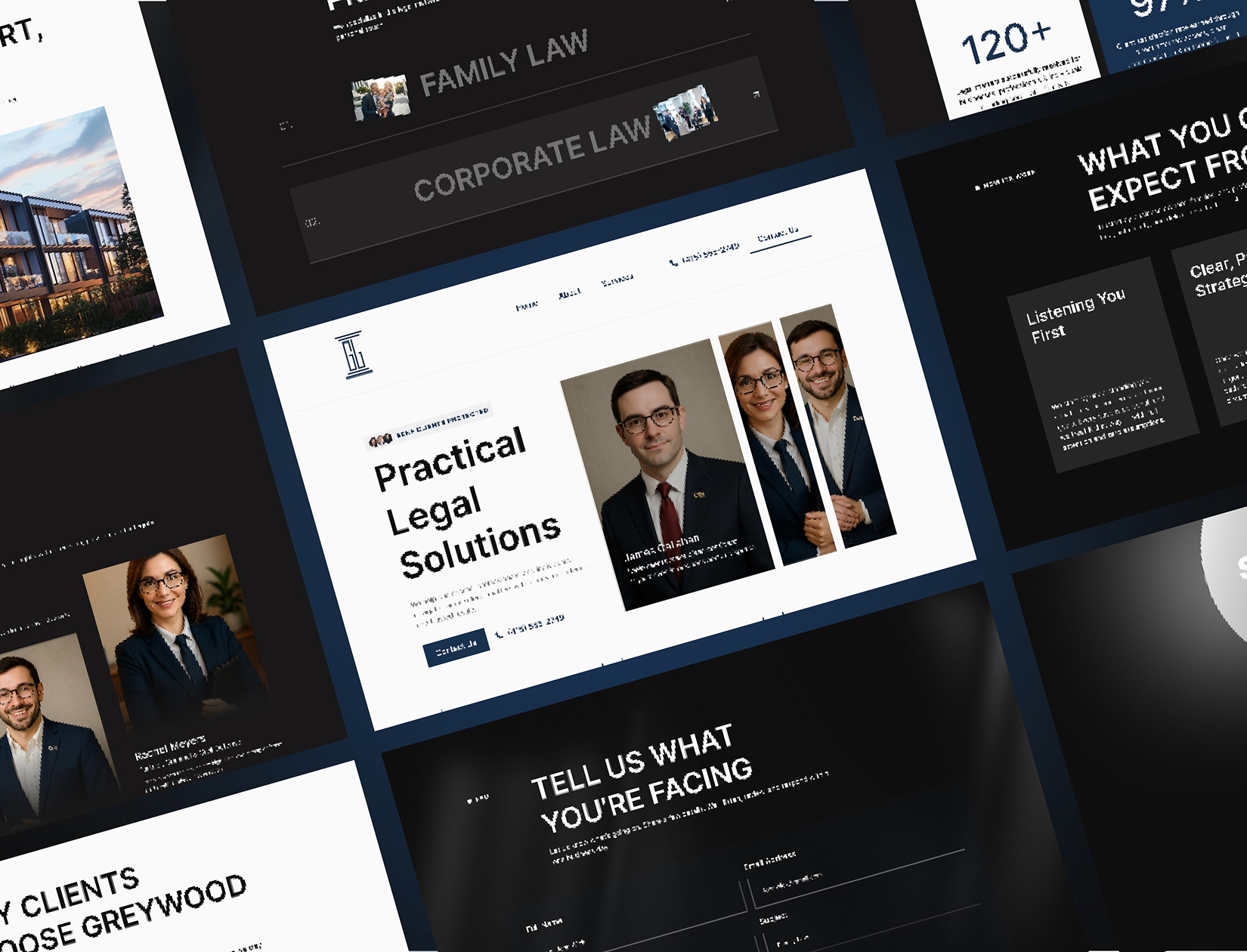
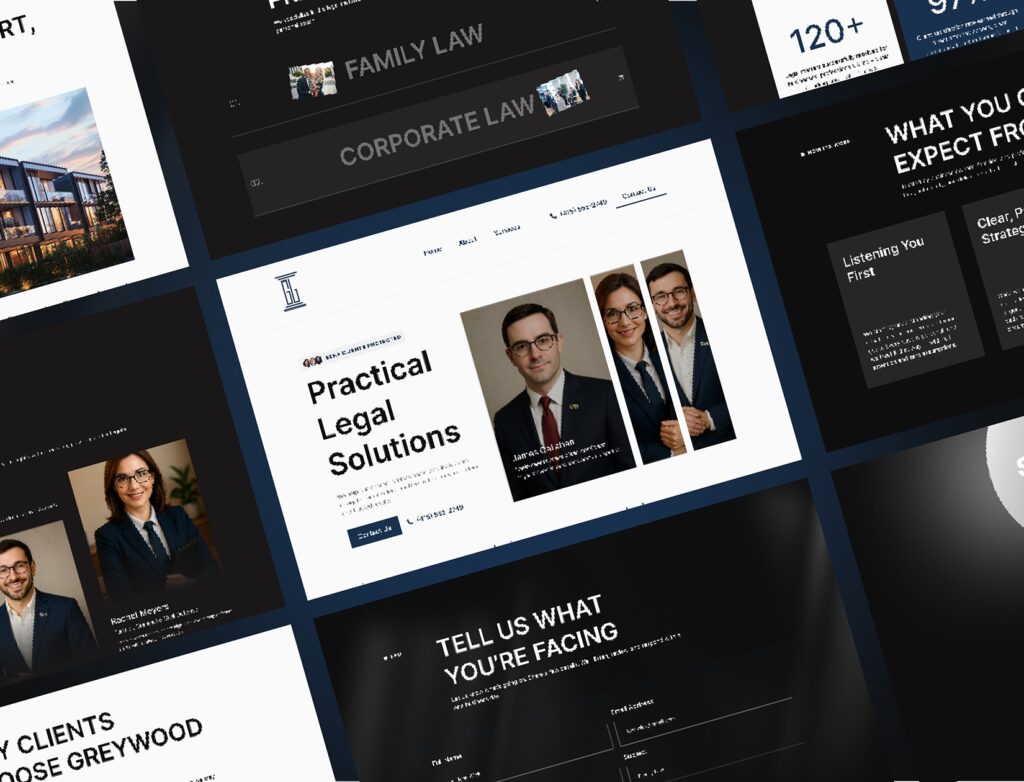
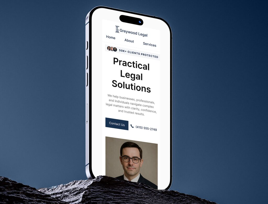
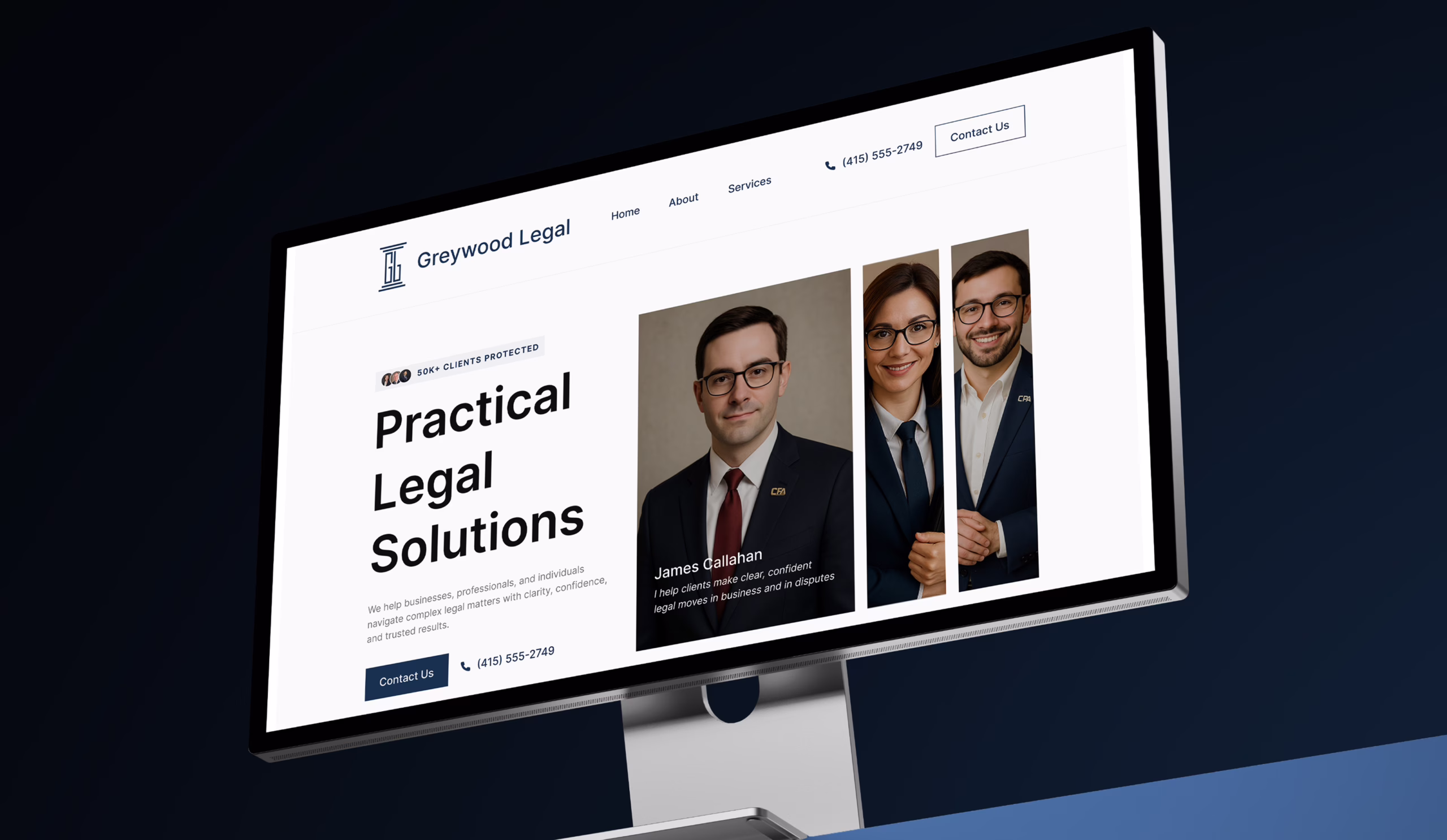
Instead of spotlighting individuals first, the structure was designed to lead with the firm. Services, values, and approach take priority, while attorney profiles support the story rather than fragment it. This reinforces the idea that clients are hiring a firm that works together, not navigating disconnected expertise.
Visually, the strategy focused on restraint and balance. Clean layouts, controlled spacing, and a limited color palette were used to create a sense of stability and professionalism. Typography was treated as a primary design element, helping guide attention and establish hierarchy without relying on heavy graphics or visual noise.
Every section was designed to answer a client’s unspoken questions:
Who are they as a firm?
How do they work together?
Can I trust them with something important?
By aligning messaging, layout, and visual rhythm, the website presents Greywood Legal as composed, confident, and dependable. The strategy ensures that the firm feels established and intentional, while still remaining approachable and human.
This foundation allows the brand to scale naturally as the firm grows, without losing clarity or cohesion.